
Master Responsive Web Design Using CSS and Media Query
What is a media query?
A media query is a css technique introduced in css3. It uses the @media rule to include a block of CSS properties that will only apply if a certain condition is true we will see some examples as we move on.
Meaning Of Some Words Used In Media Queries:
-
not: The
notkeyword reverts the meaning of an entire media query. -
only: The
onlykeyword prevents older browsers that do not support media queries with media features from applying the specified styles. You should keep in mind that it has no effects on mordern browsers. -
and: The
andkeyword combines media features.
Media Type's
Media types are used to specify the type of device.
Example of media types
|
Name |
Use |
|
all |
The default used for all media type devices |
|
|
Use for computer,tablet,smart-phone screen's |
|
screen |
used for screen readers that read the page out loud |
|
projection |
used for projected presentations, like sliders |
|
tv |
used for television-type devices |
|
tty |
use for media using a fixed-pitch character grid, such as teletypes, terminals, or portable devices with limited display capabilities. |
|
handheld |
used for handheld devices |
|
braille |
used for braille devices |
|
aural |
use for speech synthesizers |
Example of media features:
|
Value |
Description |
|
min-height |
minimum height of display area such as a browser |
|
min-width |
minimum width of the display area |
|
orientation |
the orientation of website landscape or portrait |
Example Of Media Queries Code Snippet
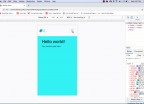
The example below will only apply the style if the browser window is 600px or smaller then the background-color will be light-blue.
@media only screen and (max-width:600px){

  /*All style's in here will only apply if the browser window is 600px or smaller*/
  background-color:lightblue;

}
Now Lets Break Down Each Line Of The Code
step:1
@media only screen and (max-width:600px) Now this line of code means that we want this style to apply only on screen's with the max-with at 600px or bellow 600px, You may also see min-width. Now min-width means that it will only apply on devices with a window size of 600px and above not bellow.
step:2
{ This signifies the beginning of the media query it's telling our browser that this code beggings from here.
step:3
background-color:lightblue;This is telling our browser to change our background color to blue.
step:4
}This is the end of the media query anything out of this will not apply to this query.
Now that we know how to create a media query lets look at some key concepts of the media query.
Media Query Orientation:
Media queries can also be used to change the layout of a webpage depending on the orientation of the browser.
Example:
With the media query below, the web page will have a green background if the orientation is in landscape mode.
@media only screen and (orientation:landscape) {

   background-color: green;

}
You should be farmiliar with everything above except for the (orientation: landscape). Now what that means is that it is telling our browser that this style should only be applied if the device is in landscape mode.
How to hide ellements with media queries?
Another common use of media queries is to hide elements on the various type of screens, you can choose to display something if the website is been viewed on desktop and you can decide to hide something if the website is been viewed on mobile plartforms.
Example:
Bellow is a media query used to hide a certain div if the screen is 600px or less.
@media only screen and (max-width:600px) {

   div.example {

      display:none;

   }

}
Now as you can see above we have called the div inside our query and set the display property to none.
Can you nest a media query?
What does nesting a media query means, this simply means that we want to create a media query inside another media query. We will be seing and example bellow on how to nest media queries.
Example:
@media only screen and (min-width:320px) and (max-width:600px) {

   /*This code will run for screen sizes between 320px and 600px */

   @media (orientation:portrait){

     /*This code will run only for portrait mode*/

   }

   @media (orientation:landscape){

      /*This code will run only for landscape mode*/

   }

}
You can also choose to have different style files for different screen sizes.
Example:
<link rel="stylesheet" media="screen and (min-width:900px)" href="widescreen.css">Any style done inside the widescreen.css will only be effective if the screen size is 900px or higher.
Feel free to leave a comment if you don't understand anything and I will get back to you and I will appreciate if you follow me thanks.

Donaciem
I trust in knowledge sharing and love sharing my knowledge with others.
- 7 years ago
learn how to setup angular 7 and firebase
Save Your Money Today!

By receiving free stock articles and smart tutorials to advance your career.


Save Your Money Today!
By receiving free stock articles and smart tutorials to advance your career...