
Learn angular 7 with angular-material and angular cli by building a todo-app in 30 minutes

Given that angular is the central point of this article let's briefly talk about angular and the tools we will use in this tutorial.
Angular is a popular frontend framework maintained by Google. Apart of its short learning curve, It's also known as a cross-platform framework because one application built with angular can be deployed for web, mobile web, native mobile and native desktop. You can visit their official website to learn more detaily about it.
Angular-material is a UI Component framework which implements Google’s Material Design Specifications for the latest version of Angular. At the time of this writing, version 7.2.0 , Angular Material provides a set of reusable and accessible UI components based on Material Design.
Angular-cli is a command line interface to scaffold and build angular apps using nodejs style (commonJs) modules. Not only does it provide you a scalable project structure, instead it handles all common tedious tasks for you out of the box.
At the moment of writing this article, the most stable version of angular is 7.1.4. We will use angular-cli and angular-material to build a simple todo application with the following features:
-
display the list of todo tasks
-
create a new task
-
delete a task
Prerequisites
Before you begin, make sure your development environment includes Node.js® and an npm package manager.
Node.js
Angular requires Node.js version 8.x or 10.x.
-
To check your version of NodeJS, run
node -vin a terminal/console window. -
To install
Node.js, go to nodejs.org.
npm package manager
The Angular CLI, and Angular apps depend on features and functionalities provided by libraries that are available as npm packages. To download and install npm packages, you must have an npm installed.
This quick start uses the npm client cli, which is installed with Node.js by default.
To check that you have the npm client installed, run npm -v in a terminal/console window.
Install the Angular CLI
You need the Angular CLI to create projects, generate application and library code, and perform a variety of ongoing development tasks such as testing, bundling, and deployment.
Install the Angular CLI globally.
To install the CLI using npm, open a terminal/console window and type the following command:
npm install -g @angular/cli
Let's create our todo app
Now it's time to use the tools we just installed to create our application with all the necessary libraries, files and packages needed. To start, we run a single angular cli command to do that. Open your terminal/console window and type the following command where app-name is the name of your application as you wish it to be called:
ng new app-nameThe ng new command will take a few seconds depending on your connection speed to setup your project. So, let us create our todo application (you just did when you typed the command above), replace the app-name with todo-app and run the following command:
ng new todo-appYou can see the project structure by openning the folder in your window explorer or in your favorite text editor as seen below.
As you can see, the src directory is where everything happen. All our components, services, modules and our entire developement flow will be going on there. our application has only one component now, the app, with its basic structure as you see here.
As you can guess, the app.componnet.css is to add a specific stylesheet to the app component, the component.html for the mockups of the component, the componnet.ts is a typescript file that contains the logic of our application. It's essentially a javascript file written in TypeScript(it's designed for development of large applications and transcompiles to JavaScript). We also have the app.module.ts and finally the app.component.spec.ts is for the unit tests of the source file. The convention for Angular applications is to have a .spec.ts file for each .ts file. They are run using the Jasmine javascript test framework through the Karma task runner when you use the ng test command. (Don't worry about terms you may not undertand now, they will be understood as you get to build more apps and compile them)
Run the application
Angular includes a server, so that you can easily build and serve your app locally.
-
Go to the workspace folder (
todo-app). -
Launch the server by using the CLI command
ng serve, with the--openoption.
cd todo-app
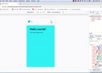
ng serve --openThe ng serve command launches the server, watches your files, and rebuilds the app as you make changes to those files. The --open (or just -o) option automatically opens your browser to http://localhost:4200/.
Baaaammmmmmm! your app is up and running:
Edit your first Angular component
Components are the fundamental building blocks of Angular applications. They display data on the screen, listen for user input, and take action based on that input.
As part of the initial app, the CLI created the first and Main Angular Component for you. It is the root component, and it is named app-root.
-
Open
./src/app/app.component.ts. -
Change the
titleproperty from'todo-app'to'My First Angular 7 App'.
import { Component } from '@angular/core';

@Component({
  selector: 'app-root',
  templateUrl: './app.component.html',
  styleUrls: ['./app.component.css']
})
export class AppComponent {
  title = 'My First Angular 7 App';
}
The browser reloads automatically with the revised title. That's nice, but it could look better.
-
Open
./src/app/app.component.cssand give the component some style.
h1 {
  color: #369;
  font-family: Arial, Helvetica, sans-serif;
  font-size: 250%;
}-
Finally open
./src/app/app.component.htmland delete the content after the h2 element as shown below.
<!--The content below is only a placeholder and can be replaced.-->
<div style="text-align:center">
  <h1>
    Welcome to {{ title }}!
  </h1>
  <img width="300" alt="Angular Logo" src="data:image/svg+xml;base64,PHN2ZyB4bWxucz0iaHR0cDovL3d3dy53My5vcmcvMjAwMC9zdmciIHZpZXdCb3g9IjAgMCAyNTAgMjUwIj4KICAgIDxwYXRoIGZpbGw9IiNERDAwMzEiIGQ9Ik0xMjUgMzBMMzEuOSA2My4ybDE0LjIgMTIzLjFMMTI1IDIzMGw3OC45LTQzLjcgMTQuMi0xMjMuMXoiIC8+CiAgICA8cGF0aCBmaWxsPSIjQzMwMDJGIiBkPSJNMTI1IDMwdjIyLjItLjFWMjMwbDc4LjktNDMuNyAxNC4yLTEyMy4xTDEyNSAzMHoiIC8+CiAgICA8cGF0aCAgZmlsbD0iI0ZGRkZGRiIgZD0iTTEyNSA1Mi4xTDY2LjggMTgyLjZoMjEuN2wxMS43LTI5LjJoNDkuNGwxMS43IDI5LjJIMTgzTDEyNSA1Mi4xem0xNyA4My4zaC0zNGwxNy00MC45IDE3IDQwLjl6IiAvPgogIDwvc3ZnPg==">
</div>
Wooooooooow looking good right ?
Great! we can now start our todo application.
Install Angular Material, Angular CDK and Angular Animations
The next thing to do will be to install this three angular packages which come with the current version of angular material design. Go to your npm command-line tool and run the following command:
npm install --save @angular/material @angular/cdk @angular/animationsYou should notice that this is a combination of three commands at the same time. the --save flag here is used to save these packages into the packages.json file which track the installed and non-installed packages. You can have a look at the packages.json file to see that those packages were automatically added at the dependencies section.
Let's import our material design components
From the angular material documentation, we can see that it's made up of multiple components that can be imported as we need. For example in this application, we will need six essential components named: MatToolbarModule, MatButtonModule, MatIconModule, MatListModule, MatDialogModule, MatInputModule
To do that, we need to inject all these modules inside our app.module.ts this are all the modules we will use for the application
//material design, animation and form modules
import {MatToolbarModule, MatButtonModule, MatIconModule, MatListModule, MatDialogModule, MatInputModule } from '@angular/material';
import {BrowserAnimationsModule} from '@angular/platform-browser/animations';
import {FormsModule} from '@angular/forms';  //for the form element


//at the import section we add  all of this
imports: [
    BrowserModule,
    MatToolbarModule,
    MatButtonModule,
    MatListModule,
    MatIconModule,
    MatDialogModule,
    MatInputModule,
    BrowserAnimationsModule,
    FormsModule,
  ],
The app.module.ts is like the Central Processor unit of an angular application. All the components, modules, services, filters and libraries all link to it. So it's like the heart of a human being. You will notice that it will get updated automatically each time you add a new component, service, ... using the ng generate command.
Component Blocks of our application
As you can see here, our app is made up of three main compoment as named above. The first component is to handle the toolbar. The second one is mainly for the listing and the last one is to add a new task to the list.
Before we start
Add this external link at the head section of your index.html for the material icon to show
<link href="https://fonts.googleapis.com/icon?family=Material+Icons" rel="stylesheet">then also add this one at the beggining of your style.css for the material design theme and the style of the add button
@import "~@angular/material/prebuilt-themes/indigo-pink.css";

body{
    margin: 0;
}

.add-btn{
    position: fixed;
    right: 20px;
    bottom: 20Px;
}
now you are ready to go.
Creating our first custom component "ToolbarComponent"
We run the following command to create a new component in angular. The last word here is the name of our component and the CLI will append .component.extension to all our files as you can see after creation.
ng generate component toolbarcode of the component ./src/app/toolbar/toolbar.component.ts
import { Component, OnInit } from '@angular/core';

@Component({
  selector: 'app-toolbar',
  templateUrl: './toolbar.component.html',
  styleUrls: ['./toolbar.component.css']
})
export class ToolbarComponent implements OnInit {

  constructor() {  }

  ngOnInit() {

  }

  title = 'TODO-APP';
}
code of the template ./src/app/toolbar/toolbar.component.html
<mat-toolbar color="primary">
  <mat-toolbar-row>
    <span>{{title}}</span>
  </mat-toolbar-row>
</mat-toolbar>
code of the style ./src/app/toolbar/toolbar.component.css
span{
    font-size: 150%;
}
The only thing to learn here is that the component has a title property with the value of TODO-APP. You should also notice that the template file has the mat- prefix string on all its tags. It's coming from the material design as I said before you can learn more from their official wesite. The {{ title }} refers to the title property for the toolbar.component.ts and we end up adding the font-size of our title with the above css.
Creating our second custom component "TasksComponent"
we do that with our generic command form angular CLI as follow:
ng generate component taskscode of the component ./src/app/tasks/tasks.component.ts
import { Component, OnInit } from '@angular/core';
import { TodoService } from '../todo.service';

@Component({
  selector: 'app-tasks',
  templateUrl: './tasks.component.html',
  styleUrls: ['./tasks.component.css']
})

export class TasksComponent implements OnInit {

  constructor(private data: TodoService) { }

  ngOnInit() {
  }

  todos: any[] = this.data.getTodos();

  deleteItem(id){
    this.data.deleteTodo(id);
    return this.todos;
  }
}
From here we start using a custom service named TodoService don't border yet about that we will get to it shortly. You should know that we are adding an array called todos that graps all the todos from the service when the component is bootstraped. We will also add a delete function there to delete a given task.
code of the template ./src/app/tasks/tasks.component.html
<mat-list>
  <h3 mat-subheader>Today</h3>
  <mat-list-item *ngFor="let todo of todos">
    <mat-icon mat-list-icon>watch_later</mat-icon>
    <h4 mat-line>{{todo.id}}</h4>
    <p mat-line> {{todo.title}} </p>
    <span style="position:relative; right: 35x">
        <a href="#" (click)="deleteItem(todo.id)"><mat-icon mat-list-icon>delete</mat-icon></a>
    </span>
    <mat-divider></mat-divider>
  </mat-list-item>
</mat-list>
here you should notice the *ngFor directive that loops through all the todos list and displays their id, title, and add a delete button with the pre-declared deleteItem() method from our typeScript logic.
Adding our data Service
Finally we add our service to manipulate the data flow within our application. Run the following command.
ng generate service todoIt's going to generate our service, let us add all our resource methods to get whatever data we need. We will have getTodos() to grap all the array content, the addTodo() to push a new element to the array and the deleteItem() to actually remove the specific element from the array. Here is the content of that service.
code of the service ./src/app/todo.service.ts
import { Injectable } from '@angular/core';

@Injectable({
  providedIn: 'root'
})
export class TodoService {
  todos: any[] = [
    {id: 1, title: 'Hello World!'}
  ];
  constructor() { }

  getTodos(){
    return this.todos;
  }

  addTodo(id:number, title:string){
    return this.todos.push({id: id, title: title});
  }

  deleteTodo(id:number){
    let index = id-1;
    if (index > -1) {
      this.todos.splice(index, 1);
    }
    return this.todos;
  }
}
To use this service we need to inject it in each component we want to use it in
e.g to use it in the tasks component we have to inject it like this as we saw previously.
import { TodoService } from '../todo.service';Creating our third and last component "AddtaskComponent"
This seems to be the most difficult part of our app due to the intergration of the material design dialog module it requires many components and libraries. Here is the code to make it work.
ng generate c addtaskHere we have to initialize the dialogRef with the material design dialog component to be able to manipulate the dialog as you can see here for example to delete the dialog with the onCancel() method. You will also see in our final main app.component.ts below how we use it to open the dialog. Then we also initialize the data variable to be able to manipulate the data between the dialog and our component.
code of the component ./src/app/addtask/addtask.component.ts
import { Component, OnInit, Inject } from '@angular/core';
import {MatDialogRef, MAT_DIALOG_DATA} from '@angular/material';
import { TodoService } from '../todo.service';


export interface DialogData {
  toto: string;
}

@Component({
  selector: 'app-addtask',
  templateUrl: './addtask.component.html',
  styleUrls: ['./addtask.component.css']
})
export class AddtaskComponent implements OnInit {

  constructor(
    public dialogRef: MatDialogRef<AddtaskComponent>,
    @Inject(MAT_DIALOG_DATA) public data: DialogData,
    private myData: TodoService) {}

  ngOnInit() {
  }

  todos: any[] = this.myData.getTodos();
  lastId: number = this.todos[this.todos.length-1].id;

  onCancel(): void {
    this.dialogRef.close();
  }

  onSave(data): void {
    this.myData.addTodo(this.lastId+1, data);
    this.dialogRef.close();
  }

}
Our template looks like this.
code of the template ./src/app/addtask/addtask.component.html
<h2 mat-dialog-title>Add a new todo</h2>

<mat-dialog-content>
    <mat-form-field class="example-full-width">
        <input matInput placeholder="new todo" [(ngModel)]="data.todo" #data="ngModel" >
      </mat-form-field>
</mat-dialog-content>

<mat-dialog-actions>
  <button mat-button (click)="onCancel()">Cancel</button>
  <button mat-raised-button color="primary" (click)="onSave(data.todo)">Save</button>
</mat-dialog-actions>
code of the style ./src/app/addtask/addtask.component.css
.example-full-width {
    width: 100%;
  }
Add the following to your app.module.ts at the ngModule object for this dialog to work.
entryComponents: [AddtaskComponent,],Final code of the AppComponent
code of the component ./src/app/app.component.ts
import { Component } from '@angular/core';
import {MatDialog} from '@angular/material';
import { AddtaskComponent } from './addtask/addtask.component';

@Component({
  selector: 'app-root',
  templateUrl: './app.component.html',
  styleUrls: ['./app.component.css']
})
export class AppComponent {

  title = 'todo-app';
  constructor(public dialog: MatDialog) {}


  openDialog(): void {
    const dialogRef = this.dialog.open(AddtaskComponent,
      {
        width: '500px',
      });

    dialogRef.afterClosed().subscribe(result => {
      console.log('The dialog was closed');
    });
  }
}
code of the template ./src/app/app.component.html
<app-toolbar></app-toolbar> <!-- for our toolbar to show -->
<app-tacks></app-tacks>     <!-- for our tasks list to show -->

<div class="add-btn">       <!-- for the add button -->
  <button mat-fab color="primary" (click)="openDialog()">
    <mat-icon mat-list-icon>add</mat-icon>
  </button>
</div>
<router-outlet></router-outlet>  <!-- for the routing we did not cover this ignore it -->
that should be all and your app is now having all the functionalities.
I am sorry if this was too long. Here is the complete code on github.

Kamdjou Duplex
the world would not be so beautiful without people willing to share knowledge


- 7 years ago
learn how to setup angular 7 and firebase

Save Your Money Today!

By receiving free stock articles and smart tutorials to advance your career.

- 7 years ago
basic command lines with linux operating system.

- 7 years ago
javascript series: variables


Save Your Money Today!
By receiving free stock articles and smart tutorials to advance your career...