
How to build a responsive and smooth sidebar menu with bootstrap 4
Even though, this seems very trivial, it was still hard to find some simple resources that can guide to do this online. Today I will show you in 5 minutes how you can build or create a responsive sidebar menu using Bootstrap 4 and some CSS.
Structure of the project
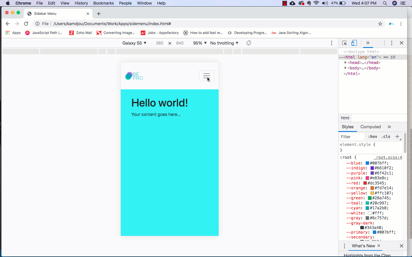
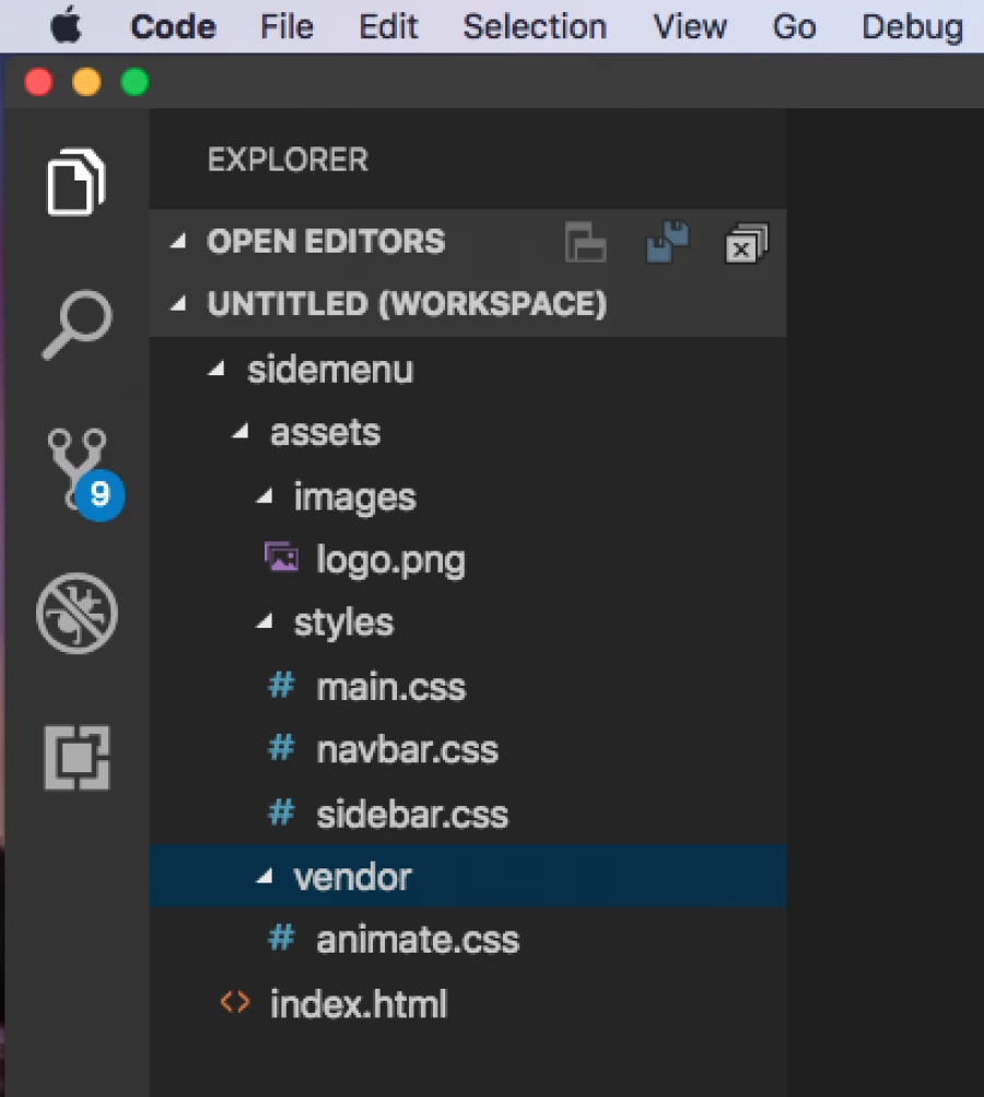
The purpose been to show how we can use Bootstrap 4 to create a sidebar menu, we will have only one HTML file to hold the three main parts of our project. In the body section, we will have the HTML nav element of the Bootstrap framework for the horizontal menu. After that, the second part will be the div element for the sidebar and the last part will be the container for the page content. Beside that, the assets folder will serve for holding assets like images, styles, scripts, vendor and … The image below is the visual representation of the complete structure on a Text-Editor.
Creating the HTML Code
The HTML file(index.html) is as simple as adding the basic structure of an HTML5 document and setup Bootstrap 4 on it. Below is the whole HTML codes we need to have the stuff working.
<!DOCTYPE html>
<html lang="en">
<head>
    <meta charset="UTF-8">
    <meta name="viewport" content="width=device-width, initial-scale=1.0">
    <meta http-equiv="X-UA-Compatible" content="ie=edge">
    <title>Sidebar Menu</title>
    <link rel="stylesheet" href="assets/styles/main.css">
    <link rel="stylesheet" href="assets/styles/sidebar.css">
    <link rel="stylesheet" href="assets/styles/navbar.css">
    <link rel="stylesheet" href="assets/vendor/animate.css">
    <link rel="stylesheet" href="https://stackpath.bootstrapcdn.com/bootstrap/4.3.1/css/bootstrap.min.css" integrity="sha384-ggOyR0iXCbMQv3Xipma34MD+dH/1fQ784/j6cY/iJTQUOhcWr7x9JvoRxT2MZw1T" crossorigin="anonymous">
</head>
<body>
    <!-- Image and text -->
    <nav class="navbar navbar-expand-lg navbar-light bg-light">
        <a class="navbar-brand" href="#">
          <img src="assets/images/logo.png" height="30" class="d-inline-block align-top" alt="">

        </a>

        <div class="collapse navbar-collapse" id="navbarTogglerDemo03">
            <ul class="navbar-nav mr-auto mt-2 mt-lg-0">
                <li class="nav-item active">
                    <a class="nav-link" href="#">Home <span class="sr-only">(current)</span></a>
                </li>
                <li class="nav-item">
                    <a class="nav-link" href="#">Link</a>
                </li>
                <li class="nav-item">
                    <a class="nav-link disabled" href="#" tabindex="-1" aria-disabled="true">Disabled</a>
                </li>
            </ul>
            <form class="form-inline my-2 my-lg-0">
                <input class="form-control mr-sm-2" type="search" placeholder="Search" aria-label="Search">
                <button class="btn btn-outline-success my-2 my-sm-0" type="submit">Search</button>
            </form>
        </div>
        <button class="navbar-toggler" type="button" data-toggle="collapse" data-target="#navbarToggleExternalContent" aria-controls="navbarToggleExternalContent" aria-expanded="false" aria-label="Toggle navigation">
            <span class="navbar-toggler-icon"></span>
        </button>
    </nav>

    <div class="sidebar collapse animated fadeInLeft" id="navbarToggleExternalContent">
        <ul class="sidemenu">
            <li>
                <a href="#">Home <span class="sr-only">(current)</span></a>
            </li>
            <li>
                <a href="#">About Us</a>
            </li>
            <li>
                <a href="#">Contact </a>
            </li>
            <li>
                <a href="#">Help</a>
            </li>
            <li>
                <a href="#">...</a>
            </li>
        </ul>
    </div>
    <div class="container-fluid">
        <div class="p-4">
            <h1>Hello world!</h1>
            <p>Your content goes here...</p>
        </div>
    </div>

    <script src="https://code.jquery.com/jquery-3.3.1.slim.min.js" integrity="sha384-q8i/X+965DzO0rT7abK41JStQIAqVgRVzpbzo5smXKp4YfRvH+8abtTE1Pi6jizo" crossorigin="anonymous"></script>
    <script src="https://cdnjs.cloudflare.com/ajax/libs/popper.js/1.14.7/umd/popper.min.js" integrity="sha384-UO2eT0CpHqdSJQ6hJty5KVphtPhzWj9WO1clHTMGa3JDZwrnQq4sF86dIHNDz0W1" crossorigin="anonymous"></script>
    <script src="https://stackpath.bootstrapcdn.com/bootstrap/4.3.1/js/bootstrap.min.js" integrity="sha384-JjSmVgyd0p3pXB1rRibZUAYoIIy6OrQ6VrjIEaFf/nJGzIxFDsf4x0xIM+B07jRM" crossorigin="anonymous"></script>
</body>
</html>
As you may realized, the nav element is from the Bootstrap 4 component. I just added my logo(trademark) there, with the toggle button which is already responsive (adopt on any screen size) and that is all. Following that, we have the div element with the sidebar with other classes and an id on it to handle the show/hide of the component accordingly. You can see that we just added some simple list (ul) to give it a sense. For the last part, it’s just the content container with a h1 and paragraph on it.
Creating the CSS Code
I believe this is obvious for you but, let’s see how it works. I decided to separate everything from each other just for clarity and simplicity. We have a assets/styles/main.css file that contains the general code that affect the entire project. Here is its source code:
body{
    margin: 0;
}

.container-fluid{
    position: relative;
    background-color: rgb(94, 241, 241);
    height: 100vh;
    z-index: 10;
}
There, we set the margin default margin of the body to 0px so that their content are bounded with no free spaces. And we also customized the container-fluid of the Bootstrap framework to make sure it is seated at the most backward layer on the page with the z-index.
Now, for the assets/styles/navbar.css file we are trying to keep it on top of all other layers. This is done by giving it the z-index of 30, note you must ensure that each element you are affecting it a z-index should have a position property otherwise it will not get affected. Here is the code snippet:
.navbar{
    position: relative;
    top: 0;
    width: 100%;
    height: 100px;
    background-color: blueviolet;
    z-index: 30;
}
Finally, we have the code for the assets/styles/sidebar.css file which is all about the layer position if the component or HTML element. Here, we are limiting the width to 80% you can put whatever value you like. For the z-index it look more nice at the second layer position as you can see we give him a value of 20. Below is it’s source code:
.sidebar{
    position: fixed;
    height: 100vh;
    width: 80%;
    background-color: rgb(212, 212, 250);
    top: 0;
    left: 0;
    z-index: 20;
}

.sidemenu{
    padding-top: 120px;
    list-style-type: upper-alpha;
    font-size: 16x;
}
How is that working ?
As mentioned earlier, everything is handle by Bootstrap. All we have to do here is to arrange the style to fit our needs. The Sidebar only shows when we are on the mobile or smaller screen size and that is why the toggle button of the sidebar was putted on the navbar and it will only appear on smaller screens as you can see on the gif image at the beginning of the article. Notice that, data-target="#navbarToggleExternalContent" is the id we are adding into our sidebar element to toggle it upon clicking of the button.
As a bonus the assets/vendor/animation.css library was added to fine tune the way the sidebar shows up upon clicking of the toggle button. To make it works like that, we added this two classes (.animated .fadeInLeft) on the sidebar element. You can customize it as you like by even adding more javascript code for that.
Thanks, for reading consider sharing with you friends. :)

Kamdjou Duplex
the world would not be so beautiful without people willing to share knowledge


- 7 years ago
learn how to setup angular 7 and firebase

Save Your Money Today!

By receiving free stock articles and smart tutorials to advance your career.


Save Your Money Today!
By receiving free stock articles and smart tutorials to advance your career...